If you’ve ever stood in front of a hundred white chips at a paint shop and left more confused than when you arrived, you’re not alone. Whites are deceptively complex. They carry undertones, react to light, and shift when paired with different finishes and furnishings. This guide will help you cut through the noise and choose the right white for each room with confidence.
Why are whites harder than they look?
White is not a single color. It’s an entire family of shades that range from crisp, cool whites to soft, warm creams. The differences are subtle, but they matter.
Undertones like pink, yellow, blue, or green quietly shape the personality of each white. Natural light, artificial light, flooring, and even the materials in the room all change what you actually see on the wall. That’s why the same white can look fresh in the morning and flat by evening.
When you pick a white, you’re choosing the backdrop for everything else in the room. It should complement your furniture, your flooring, and the mood you want to create.
Start with one simple question:
What feeling do I want in this room?
Calm and airy, cozy and warm, bright and modern, or moody and quiet? Your answer will guide whether you choose a cooler or warmer white, a brighter or softer one.

Start with the room’s light profile
Light is the most important factor when choosing white.
-
North-facing rooms have cooler, bluer light. Warm whites help keep them from feeling cold or clinical.
-
South-facing rooms receive bright, warm sunlight that can amplify warm whites. In these spaces, cooler whites often feel cleaner and more modern.
-
East-facing rooms benefit from soft morning light that flatters balanced neutrals and gentle whites.
-
West-facing rooms get golden evening light that can intensify warm undertones and make some whites feel more yellow than you expect.
A simple method: test a swatch directly on the wall and observe it throughout the day. Look at it in morning, midday, and evening light. If a white reads chalky under one light and yellow under another, consider a more neutral or shaded option.
If you want a flexible white that doesn’t swing too warm or too cool, Pale Marble is a balanced neutral that tends to stay consistent across changing light conditions. You can also preview how these tones behave in different rooms by visualizing them directly on the Jax & Hue website.
Understand undertones and how to use them
Undertones are the quiet colors mixed into white that make it feel creamy, cool, or neutral. They’re the reason one white feels soft and inviting while another feels crisp and architectural.
General guidelines:
-
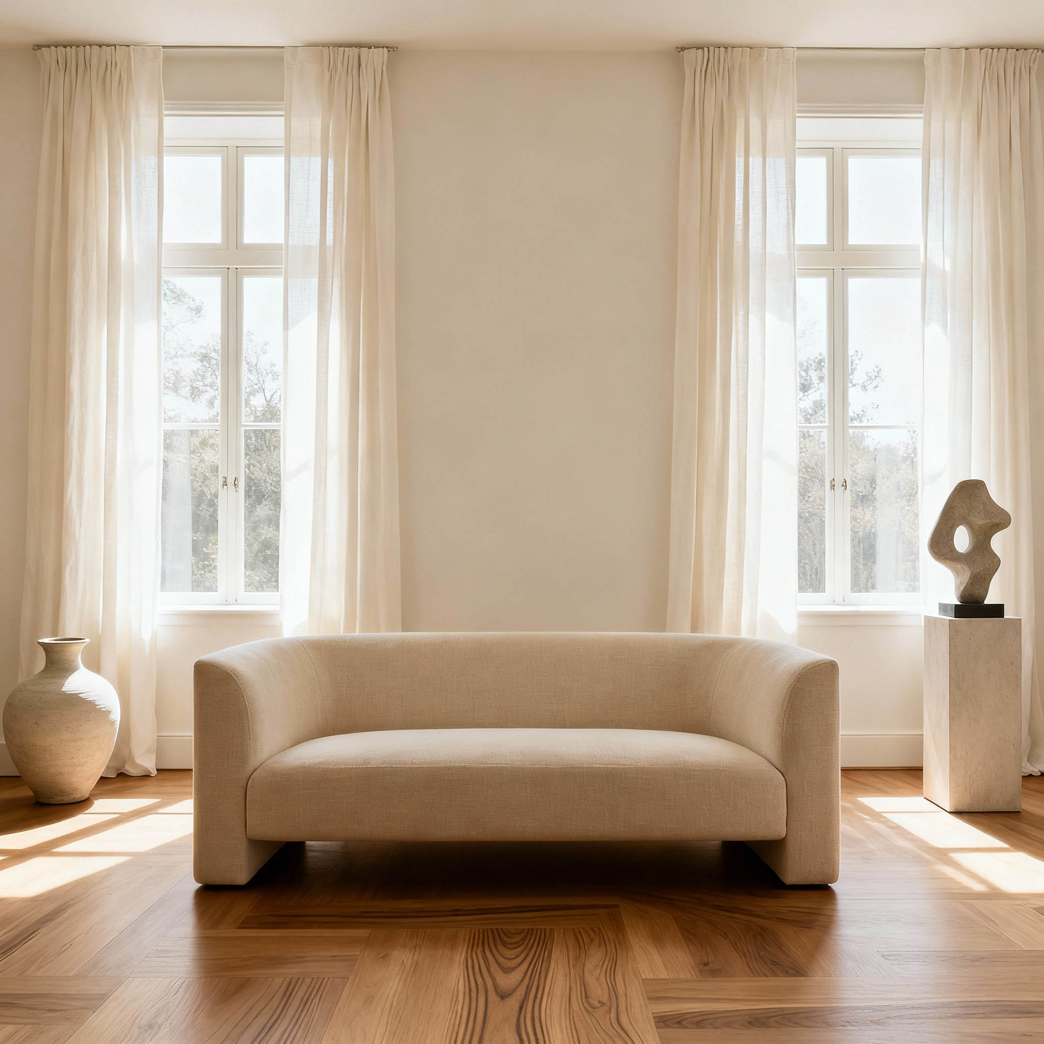
Warm whites (with soft yellow, beige, or creamy undertones) instantly bring a sense of comfort. They’re ideal for living rooms and bedrooms, especially with warm wood floors, natural fibers, and cozy textiles.
-
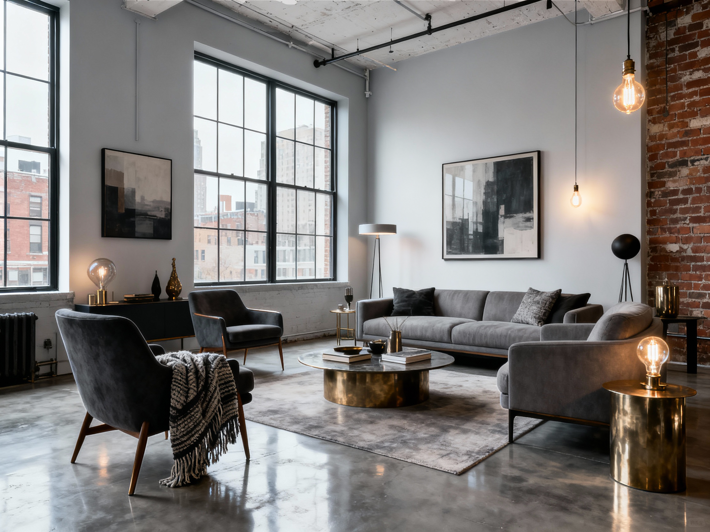
Cool whites (with blue, gray, or subtle green undertones) feel clean, sharp, and modern. They shine in contemporary kitchens, bathrooms, home offices, and minimalist spaces where clarity and brightness matter.
-
Neutral whites sit right in the middle. They’re balanced, versatile, and incredibly reliable if you want one shade to flow across multiple rooms. These are great for open-concept spaces and homes where you want harmony without everything feeling flat or identical.
A practical trick: hold your white swatch next to two key items in the room, like your rug and sofa. If the white clashes with either, it’s not the right fit.
Some easy starting points from the Jax & Hue palette:
-
Cloud Milk and Ivory Lilt – soft, creamy shades that warm up a space and look beautiful with natural wood and layered textiles.
-
Gallery White – a fresh, streamlined white that feels crisp and clean without veering into harsh or sterile.
-
Cast Linen – a gentle, grounded neutral that sits comfortably between warm and cool, making it a strong choice when you want flow from room to room.

Decide by function, not just style
Think about how each room is actually used.
-
Kitchens and bathrooms benefit from durable finishes and whites that hold up well under artificial lighting and moisture.
-
Bedrooms and living rooms can host softer, warmer whites that invite rest and relaxation.
-
Open floor plans often work best with a cohesive family of whites and soft neutrals that flow together, rather than dramatically different whites in every zone.
Also consider sightlines: if you can see multiple rooms at once, choose whites that harmonize rather than compete. Slight shifts in warmth or depth can be beautiful, as long as the undertones are aligned.

A simple testing routine that actually works
Instead of guessing, follow a quick, repeatable process:
-
Order swatches of three whites from the same palette.
-
Tape them on the wall at eye level in the room you’re painting.
-
Observe them in morning, midday, and evening light.
-
Compare them against your flooring, trim, and soft furnishings.
-
If you’re undecided, paint a larger sample area to see how it behaves on a bigger surface.
-
If the white feels “off,” adjust slightly warmer or cooler—not drastically.
It takes a little time, but it saves you from costly repainting and regret. You can also use the Jax & Hue site tools to visualize your shortlisted whites before committing.
Test whites in adjacent pairings
Most people test a white in isolation, but the way whites relate to one another across rooms matters just as much.
If your home has open sightlines, test two whites side by side where the rooms meet—a hallway and living room, for example. This reveals whether one suddenly looks dingy or overly yellow next to the other. You’ll often find that harmony between whites is more important than how any single shade looks alone.
Quick rule cheat sheet
-
North-facing rooms: choose a warm white to soften cool, blue light.
-
South-facing rooms: consider a cooler white to keep things crisp and avoid overly warm walls.
-
Small rooms: a brighter white can make them feel more open and spacious.
-
Open-plan spaces: pick a neutral family with gentle shifts in warmth and depth to maintain flow.
-
If in doubt: order a swatch, test it in your space by day and night, and adjust in small steps.
Bringing it all together with Jax & Hue whites
Choosing between whites that look “almost the same” on a screen can feel overwhelming. But once you understand light, undertones, finish, and function, you’re not guessing anymore—you’re designing.
Within the Jax & Hue palette, you can reach for:
-
The crisp clarity of Gallery White
-
The softness of Cloud Milk
-
The cozy warmth of Ivory Lilt
-
The balanced subtlety of Pale Marble
-
The grounded neutrality of Cast Linen
-
The airy, quiet elegance of Whisper Plaster
Each shade is crafted to behave beautifully in real homes, under real light.